Content for TS 23.040 Word version: 18.0.0
0…
3…
3.3…
4…
8…
9…
9.2…
9.2.2.2…
9.2.2.3…
9.2.3…
9.2.3.12…
9.2.3.24
9.2.3.24.1…
9.2.3.24.10…
9.2.3.24.10.1.12…
9.2.3.24.10.2…
9.2.3.24.11…
9.2.3.25…
9.3…
10…
10.1.1…
10.1.3…
10.1.5…
10.1.7…
10.1.9…
10.1.11…
10.1.13…
10.1.15…
10.1.17…
10.2
10.2.1…
10.2.3…
10.2.5…
10.2.7…
10.3
11…
A…
C
C.1…
C.3…
C.5…
C.7…
C.9…
C.11…
C.13…
C.15…
D…
E…
F…
G…
G.2…
G.6
G.7
H…
I…
J…
K…
G.2 Graphical elements
G.2.1 Line elements
G.2.1.1 Polyline
G.2.1.2 Circular Polyline
G.2.1.3 Bezier Polyline
G.2.1.4 Auto-closure of a line
G.2.2 Polygon elements
G.2.3 Simple shape elements
G.2.3.1 Ellipse
G.2.3.2 Rectangle
G.2.4 Special shape elements
G.2.5 Text element
G.2.6 Group elements
G.2.7 Reuse element
G.2.8 Animation elements
G.2.8.1 Simple animation elements
G.2.8.2 Standard Animation Element
G.2.9 Frame Element
G.2.10 Local Element
G.2.11 Extended Element
G.3 Element attributes
G.4 Element Transform
G.5 Character Size WVG Element
...
...
G.2 Graphical elements p. 179
WVG defines a set of graphical and animation elements. Among them, line, shape and text elements are the building blocks to form a drawing. These elements can be transformed, grouped and animated. There are also special elements that are auxiliary.
G.2.1 Line elements p. 179
There are 3 types of lines: polyline, circular polyline and bezier polyline. A polyline can represent a dot when there is only a start point defined.
A line element has its reference point at the starting point. A reference point of an element specifies the location of the element.
G.2.1.1 Polyline p. 179
Polyline is a set of straight lines connecting a sequence of points. When there is only one point, it is defined as a dot.
G.2.1.2 Circular Polyline p. 179
Circular Polyline is a line that contains at least one circular curve segment. The curve segment connects two adjacent points by a circular arc. The curve segment is determined by the two adjacent points and a curve offset (the perpendicular distance from the center of the line connecting the adjacent points to the circular arc).
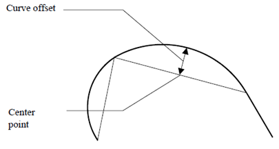
Curve offset values are within the range - 0,5 to 0,5, inclusive. A value of 0,5 or - 0,5 identifies that the curve offset equals half of length of the connecting line. The value indicates that the curve is close to a half circle. A positive value indicates that the curve is at the left side of the base line viewed from the curve direction. A negative value indicates that the curve is at the right side of the base line viewed from the curve direction.
G.2.1.3 Bezier Polyline p. 180
A Bezier Polyline contains one or more off curve control points in between on curve points. Bezier curves can be filled to create curved shapes and are common in generalized font representations.
All line elements have direction from the start point to the end point.
Color fill may apply to a line. Refer to clause G.2.1.4.
G.2.1.4 Auto-closure of a line p. 180
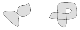
When a line is specified with the fill attribute, the line is considered as a closed line, which connects the start point and the end point using a straight line. The enclosed area of a closed line can be used for color fill.
The enclosed area is based on nonzero fill rule. Following are two examples in which the light color indicates the enclosed area.
G.2.2 Polygon elements p. 180
Polygon elements are closed representations of polyline, circular polyline and Bezier polyline elements. Polygons may have separate line and fill colors or may not be filled at all.
Polygon elements use the nonzero fill rule for enclosed areas and can be used for color file.
A polygon element has its reference point at the starting point.
G.2.3 Simple shape elements p. 180
Simple Shapes are rectangles and ellipses. A simple shape is defined by width, height, center point, and angle of rotation. The angle parameter defines how much the shape should be rotated about its center from a horizontal axis drawn through its center. Note that angle units are specified in the main header.
G.2.3.1 Ellipse p. 180
Ellipses are defined by their major axis, minor axis, center and angle of rotation. Circles are considered a special case of ellipse in which the major and minor axis are the same length.
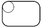
G.2.3.2 Rectangle p. 180
Rectangles are represented by their center, width, height, and rotation angle. Squares are considered special rectangles in which the width and height are identical.
When the "round corner" indicator is set, the corner of the rectangle should be rounded. There is no specific radius of the round corner is defined. The recommended radius of the rounded corner should be 20% of the length of the shorter edge of the rectangle or the square.
A simple shape element has its reference point at its center.
G.2.4 Special shape elements p. 181
There are 3 types of special shapes. These shapes are Regular Polygons, Stars, and Grids. Each shape has a reference point that determines its position for the purpose of transformations such as detailed in G2,8,1 and G,4. Shapes may have other parameters. These shapes include:
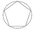
- Regular polygon: a regular polygon has equal length of all its edges. In its original position, the bottom edge of the regular polygon should be aligned horizontally. A rotate angle can be optionally specified. Regular polygon parameters include the number of vertex, the diameter of the reference circle and angle of rotation.
- Star: a star is defined by the number of corner vertex, the diameter of the reference circle, vertex angle and angle of rotation. In its original position, the bottom edge, which formed by two vertexes of the star, should be aligned horizontally. A rotate angle can be optionally specified. Vertex angles are predefined as 0, 36, 60, 90 degrees.
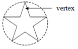
If the vertex angle is 0, a single line from center to vertex shall be drawn.
- Grid: a grid is a number of evenly distributed perpendicular lines. Its parameters include height, width, angle and number of rows and columns (up to 16).
G.2.5 Text element p. 181
WVG supports text display inside the drawing. However it supports only the default font. To avoid inconsistency on different terminals, it is recommended to use vector based font. Text can be placed in a drawing with position, font size and rotate angle. Like other elements, text has attributes of line style, line color, line width. It can also be animated.
Control characters are ignored when the text is rendered except for the CR (Carriage Return). The CR indicates the text followed by should be displayed at the next line position. Multi-line text should be left aligned. There is no character spacing and line spacing defined. Recommended character spacing is 10% of the text height. Recommended line spacing is 20% of the text height.
A text element has its reference point at top-left corner.
G.2.6 Group elements p. 182
A set of elements can be grouped together.
The Group element is used to mark the start and end of grouped elements. A group of elements starts with a Group element which has the end-group indicator off, followed by a list of elements in the group, and ends with an Group element which has the end-group indicator on. Groups can be nested. Implementation must support at least 2 levels of nested group.
Group (start)
Element 1
Element 2
…
Group (start)
Element a
Element b
…
Group (end)
Element n
Element n+1
…
Group (end)
G.2.7 Reuse element p. 182
Reuse element can be used to display an element or a group of elements with a transform and/or changed attributes and/or display an array. Whether a reuse element references a group or a basic element depends on the element type that the element_index in the reuse element points to. When reuse array is specified, the referenced element or group of elements is duplicated in rows and columns. The reference point of a reused array is at the reference point of the top-left element in the array.
G.2.8 Animation elements p. 182
There are two types of animation elements, Simple Animation Element and Standard Animation Element. In the data format, a simple animation element is followed by another element or a group element that the animation applies to. A standard animation element has pointer or index that points to another element or a group element.
G.2.8.1 Simple animation elements p. 182
Simple animation is defined for WVG. All animation timing is based on an "Animation Cycle". WVG animation is repetitive. After completion of playing one cycle, a subsequent cycle play commences immediately.
There are two types of animation cycles defined, short cycle and long cycle. The time length of animation cycles are not defined. The time length of a long cycle should be twice the length of a short cycle. Recommended short cycle should collapses for 1 second and long cycle pay for 2 seconds.
There are two types of animations.
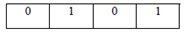
Visibility: an element can be visible or invisible during a specific cycle segments. A short cycle is divided into 4 time segments equally and a long cycle is divided into 8 time segments equally.
In the following example, a visibility for short cycle animation is defined. The element to be animated will blink following the pattern defined in the Visibility field below. Bit 1 indicates the element should be displayed during the time segment. Bit 0 indicates it should not be displayed during the time segment.
 In the following example, a visibility for long cycle animation is defined. The element to be animated will blink following the pattern defined in the visibility field below.
 Round Rotation: an element can be rotated at clockwise or counter-clockwise directions.
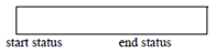
Transform: a start and an end transform can be applied to an element to describe the start and end position of a rotate, a scale, a translate animation or any combination of these action. When a transform element is omitted, it defaults to use the element's original position. An animation element must include at least one transform element. The animated element can also be a group to allow the animation action applied to a group of elements.
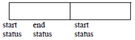
In simple animation, a transform from start position to end position should be completed in one cycle. A bounced flag can be turned on to allow "bouncing" animation. A bounced transform transforms the element from start position to end position in one cycle.
Transform in a short cycle:
Round Rotation: an element can be rotated at clockwise or counter-clockwise directions.
Transform: a start and an end transform can be applied to an element to describe the start and end position of a rotate, a scale, a translate animation or any combination of these action. When a transform element is omitted, it defaults to use the element's original position. An animation element must include at least one transform element. The animated element can also be a group to allow the animation action applied to a group of elements.
In simple animation, a transform from start position to end position should be completed in one cycle. A bounced flag can be turned on to allow "bouncing" animation. A bounced transform transforms the element from start position to end position in one cycle.
Transform in a short cycle:
 Bounced Transform in a short cycle:
 Transform in a long cycle:
 Bounced Transform in a long cycle:
 Visibility and transform animation can be applied to the same element.
G.2.8.2 Standard Animation Element p. 184
A Standard Animation Element contains animation information such as begin transform position, end transform position, begin color, end color, begin time, end time, etc. This allows one animation element to represent a series of related images, which results in significant compression of the data stream. The WVG player interpolates between the beginning state and end state to achieve animation.
Animation elements are not allowed inside groups. Animation rotation ranges from 0 to 360 degrees in both clockwise and counter-clockwise directions.
G.2.9 Frame Element p. 184
Frame Element is as a marker of the start of a new frame. All elements before a frame element belong to previous frame. The delay between two frames is defined as an infinite time interval. This means says that once a frame marker is reached, the elements that have been displayed on the screen at this time will stay on the screen until the user requests that the next frame should be displayed. The idea is that one can have multiple "pages" of graphics, such as a multi-page cartoon. The user can then study the first page and when finish can press a button (or trigger some other event) to see the next page of the cartoon. The mechanism of the user event is not defined and is left up to the application developer.
Here are parameters of a frame element:
- keep last frame contents (or not). Zero means not keeping last frame contents, otherwise all the contents of previous frame will be kept.
- fill in a new background color (or not). Zero means no new fill color is needed for this frame, otherwise a new background color will be used.
- new background color.
G.2.10 Local Element p. 184
This element defines the size and position of a local envelope.
The local envelope is a square area whose top-left corner is defined as the origin for its x and y-axis. The number of grid lines are pre-defined to 7, 15, 31 and 63. The resolution is constant in a local grid which is pre-defined at 1/27, 1/32, 1/48, 1/64, 1/85, 1/128, and 1/160 of the local envelope width. Actual envelope size can be determined by number of grid lines and grid resolution. The position of the local envelope is determined by the local envelope origin that falls at a coordinate within the global envelope.
A local element cannot appear in between another local start and local end element.
G.2.11 Extended Element p. 184
The Extended Element is defined to create objects which are not part of the base parsing level of defined objects in the present document and as a future proof method of expansion as defined by 3GPP technical committees. The extended element is intended for resolving problems in the current release. It may also be possible to use the extended element for potential enhancements in future releases. If the decoder encounters an extended element and the extended element type is unrecognized, it can gracefully skip this element by seeking past it in the bitstream, and continuing decoding at the next element in the bitstream.
An extended element contains the size of the extended element, the extended element type, and a series of bytes representing the payload data. The size field represents the payload data size in bytes. Note that when reading the payload data, bit alignment should be assumed (not byte alignment).
G.3 Element attributes p. 185
Each element has a number of attributes such as pen color, fill color and line width used for stroking. The following elements Line, polygon, shape and text elements have the listed attributes.
 Dotted Line: a dotted line is a string of circular dot on the path of a line. It is recommended that the diameter of rounded dot is same as the line width. The space between two dots shall be between 1 to 2 dot diameters.
 Line Cap:
Line cap is Circular.
Line Joint:
Line joint is Round for line joint.
Line Cap:
Line cap is Circular.
Line Joint:
Line joint is Round for line joint.
- Line width: 3 levels (fine, medium, thick). Default is fine.
- Line style: 4 types (solid, dash, dot and reserved). Default is solid.
- Pencolor and fill color.
G.4 Element Transform p. 185
The Transform element is used to scale, rotate, or translate any single element or group of elements. Multiple transforms may be applied in succession to any element by standard matrix concatenation. The transform element may be included in Group, Reuse and Animation elements and applied to line, polygon, shape, text and group elements. The sequence of applying transform operations is scale→rotate→translate.
G.5 Character Size WVG Element p. 185
The character size WVG, or glyph is a subset variation of WVG. Character Size WVG uses a compact coordinate system with a half resolution global grid (7, 15, 31 and 63 grid lines), default color (monochrome), line elements (polyline, circular polyline and Bezier polyline) and a simplified drawing header.